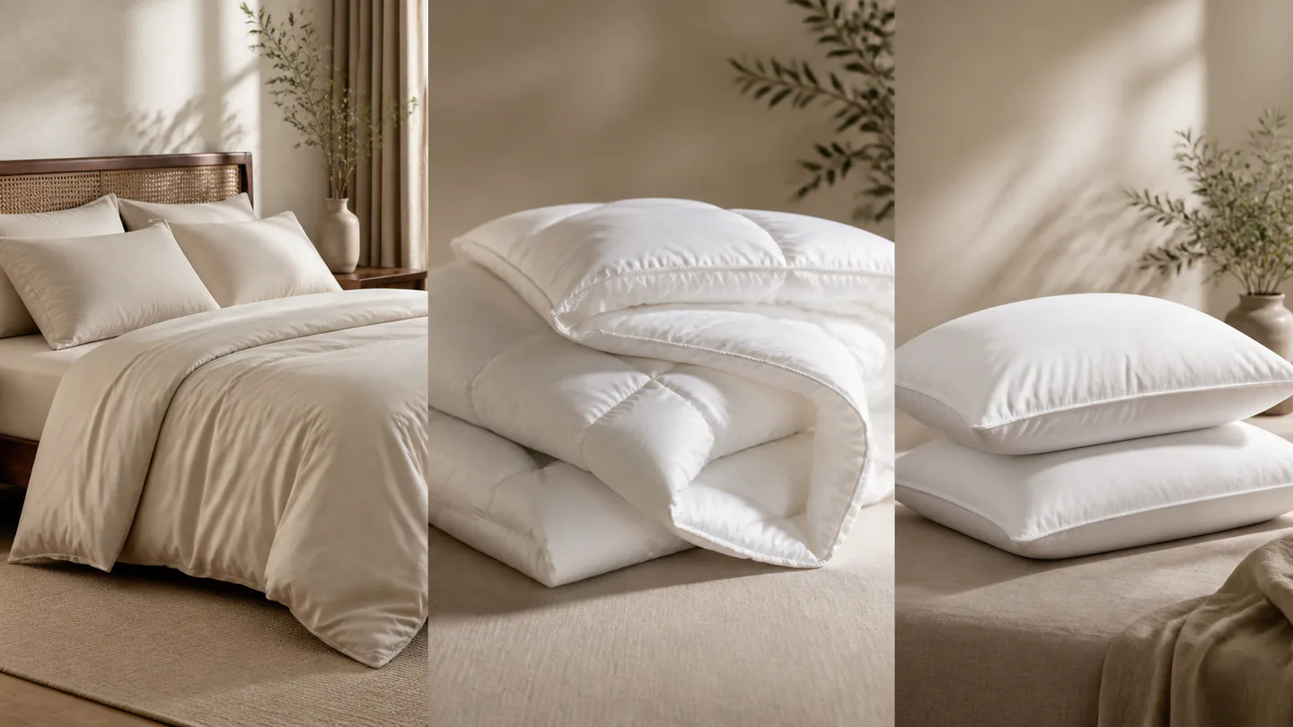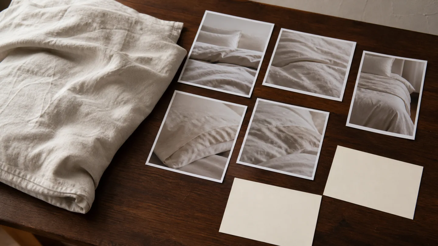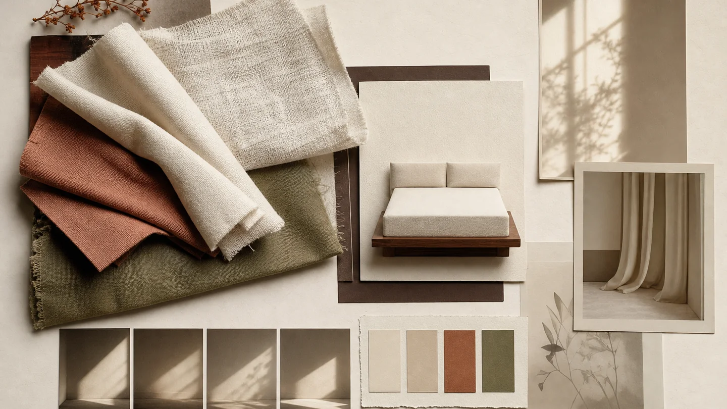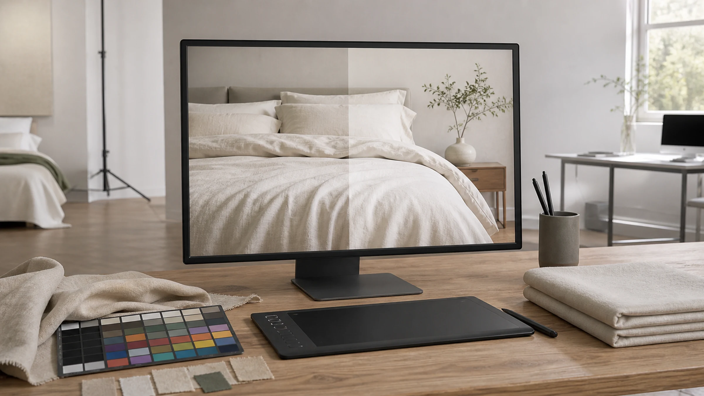
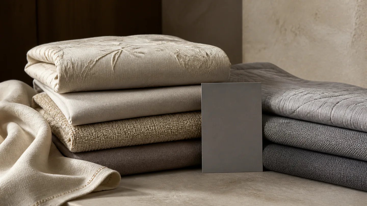
A textile image needs to show color alongside weave, sheen, pile, quilting or embroidery. Simply making everything brighter can flatten texture; strong contrast can obscure the color the buyer needs to understand.
This is a general preparation and review framework. It does not establish that Old Money Visual uses a particular equipment brand, calibration device or fixed process. Agree the sample, reference color, output and acceptance method for the project.
Review color and texture as two connected tasks
For color, establish repeatable and comparable conditions: identify the actual sample or approved reference, use stable lighting and settings, and state the intended output. For texture, decide the light direction, product state and close-up scale needed to explain the surface.
Bring the checks together before approval. Showing texture should not introduce an unacceptable color cast; evening out color should not erase real weave, pile, folds or changes in sheen.
- Identify the sample, style code and color name
- State the listing, product-page, catalog or content use
- List views needed for color and for texture
- Check product, background, light and reflection at the test stage
- Name the final color approver and viewing conditions
Choose a reference instead of relying on screenshots
The project may have a finished sample, fabric swatch, design file, specification sheet and older photograph. Decide which is the primary color reference and record the style, shade, batch or version. If batches differ, the brand must identify which sample governs this shoot.
Chat screenshots, social posts and unverified old images may have been compressed, filtered or repeatedly saved. They can indicate a direction but should not be the sole color authority. Use approved names and material facts rather than inferring specifications from a picture.
- Sample, style, color and batch identifiers
- Primary and supporting references
- Pattern, gradient and color-block relationships to preserve
- Approved fiber and construction information
- Unacceptable shifts and previous color problems
Make lighting and the environment repeatable
Light color, reflected surroundings, background material, exposure and white balance all affect the relationship between colors. Record a workable setup at the test stage, avoid unexplained light changes and watch for saturated props reflecting onto the textile. Keep a neutral or standard reference when needed.
A reference target provides known information; it does not automatically remove every color difference. Capture it under the same or comparable lighting as the product. Reassess its relevance if the light, camera position or surroundings change substantially.
- Record key light, ambient light and background changes
- Check colored reflections from walls, props and bed surfaces
- Keep reference frames under comparable conditions
- Record changes to exposure and white-balance decisions
- Recheck product color after lighting or setting changes
Use light that explains the particular surface
Plain weave, jacquard, embroidery, pile and shiny fabric do not contain the same visual information. Soft directional light may reveal a fine weave; pile and loft need visible edges and volume; raised stitching, quilting and embossing need enough tonal separation to be legible.
A reflective or angle-sensitive textile may look different from one viewpoint to another. Use a full view, an oblique view and a close-up to explain color, form and surface behavior rather than asking one frame to show everything.
More directional light can strengthen texture while producing highlights and shadows that complicate color judgment. Frontal light may show a more even color area while flattening relief. Test the balance on the actual fabric.
Keep capture, display and output connected
Capture files, editing software, displays and final web or print output all affect color presentation. ICC profiles describe device or color-space characteristics to support more consistent interpretation. They cannot fix unsuitable original lighting or make every uncalibrated screen look the same.
Avoid comparing versions that have been repeatedly passed through different chat apps. Agree the review file, color space, format and intended output. Print work needs its own proof and confirmation against actual printing conditions.
Display calibration and profiles can improve repeatability, but audience screen settings, brightness, eye-comfort modes and room light still vary. The practical goal is a process that can be explained and reviewed, not a promise of identical color on every device.
Correct product issues before applying a visual style
White balance, brightness, distracting reflections, backgrounds and small blemishes can be addressed in post-production. Check product fidelity before adding strong color treatment or contrast, so the team can distinguish capture issues from intentional styling.
Clear texture does not mean aggressive sharpening. Excessive clarity, noise reduction, smoothing or local contrast can invent detail, erase it or make a soft surface appear harsh. Agree edits that affect how the product is understood.
Keep relatively neutral product views for judging color, material and construction, and let room scenes carry more atmosphere where appropriate. Distinct purposes are easier to manage than demanding that every frame be both neutral and heavily stylized.
Check the sample, the thumbnail and the close-up
Review color with the agreed reference file and stable viewing conditions, using consolidated feedback from someone who knows the product. Review texture at both whole-image and detail scales: the product must remain recognizable when reduced and believable when enlarged.
Make feedback specific: the neutral full view is too warm, the gray area reflects the backdrop, the pile looks flattened, or a highlight hides the embroidery. Include the style code and filename; color is wrong does not locate the problem.
- Files match style, color and component identifiers
- Neutral views checked against the sample or approved reference
- Atmospheric color treatment does not conceal product identity
- Weave, pile, quilting, embroidery, edges and sheen remain clear
- Sharpening or smoothing has not created false material detail
- Thumbnail, large product-page and output versions checked
- One reviewer consolidates file-specific feedback
Put this guide into a production plan
Confirm the actual scope from your samples, channels and accuracy requirements; these services are not automatically bundled.
Managed AI Product Visuals
Done-for-you AI product images and selected motion variations with human direction and product-accuracy review.
Review the service scope →USE FOR · Product launches, catalogs and buyer presentationsTextile Product Photography
Photograph bedding, fabrics and towels in China for listings, catalogs and buyer presentations.
Review the service scope →